With so many beautiful NuWallpaper designs, one of the most common question we’re asked is, “Which pattern is your favorite?” Of course we love all of our collections, but each person has their own individual style and is bound to gravitate toward specific colorways and prints. So which NuWallpapers made cut? Here are the following favorites from various WallPops staff members.
1.Grace, Product Designer for Wallpops: Lemon Drop and Metrolpolis
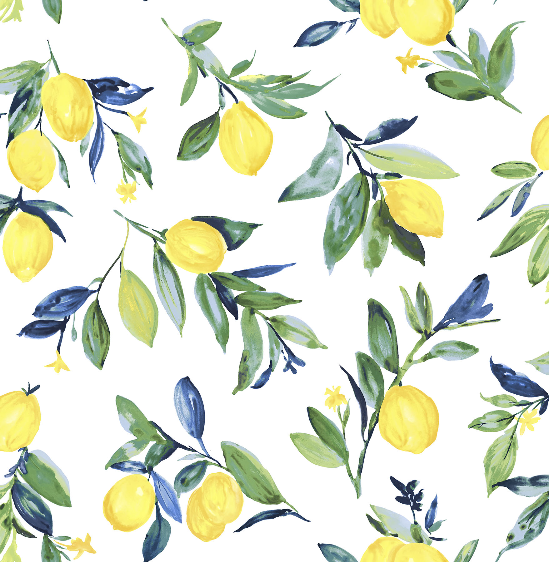
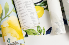
Lemon Drop NuWallpaper 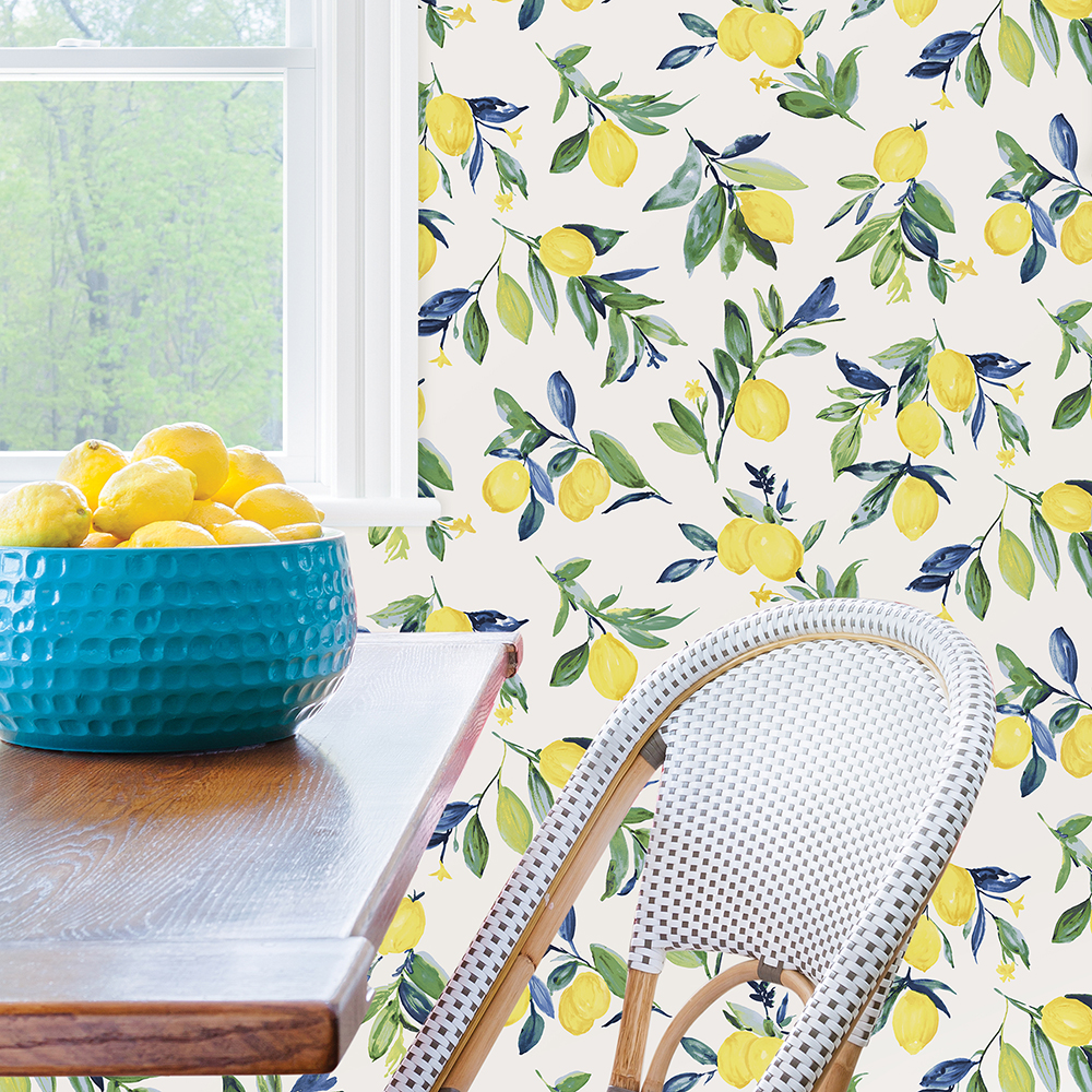
“The Lemon Drop NuWallpaper is joyful and fun! This vintage look is a perfect mix of stylish and classic, and is perfect for brightening up any space.”
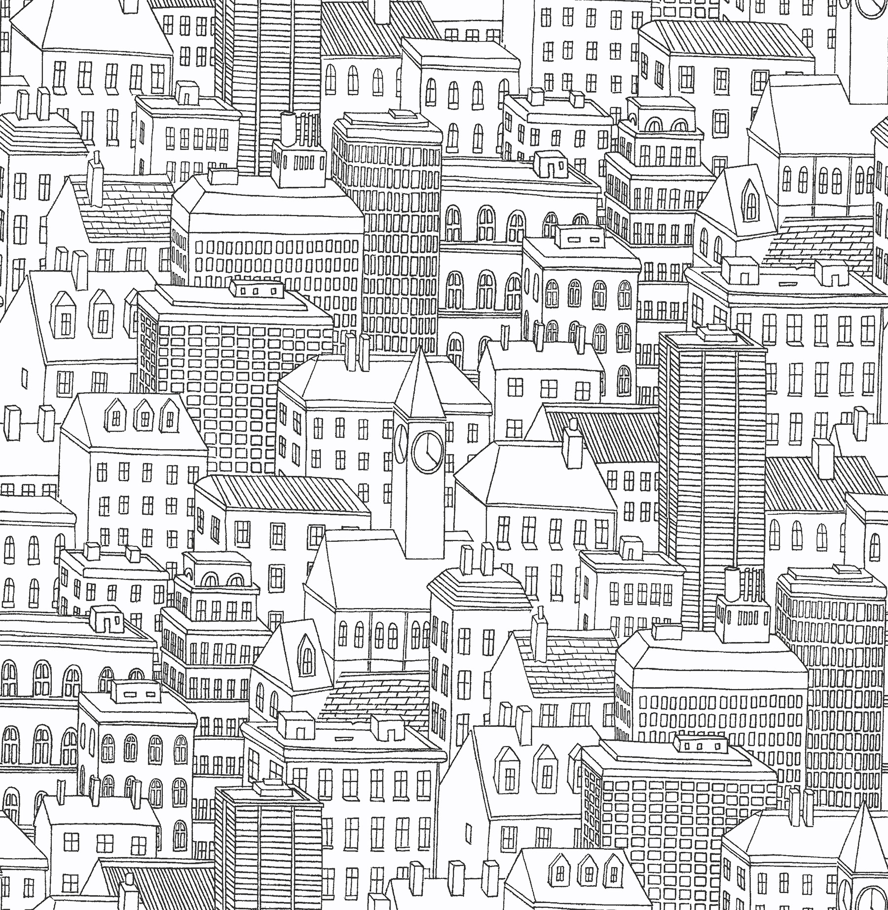
Metropolis NuWallpaper 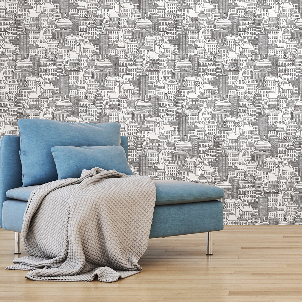
“This modern and illustrative NuWallpaper is so unique and a great complement to a contemporary space. If you love the fun and quirk of city living, the Metropolis peel and stick wallpaper is for you!
2. Scott, Executive Director of Product & Marketing: Gray Wood and Summer Love
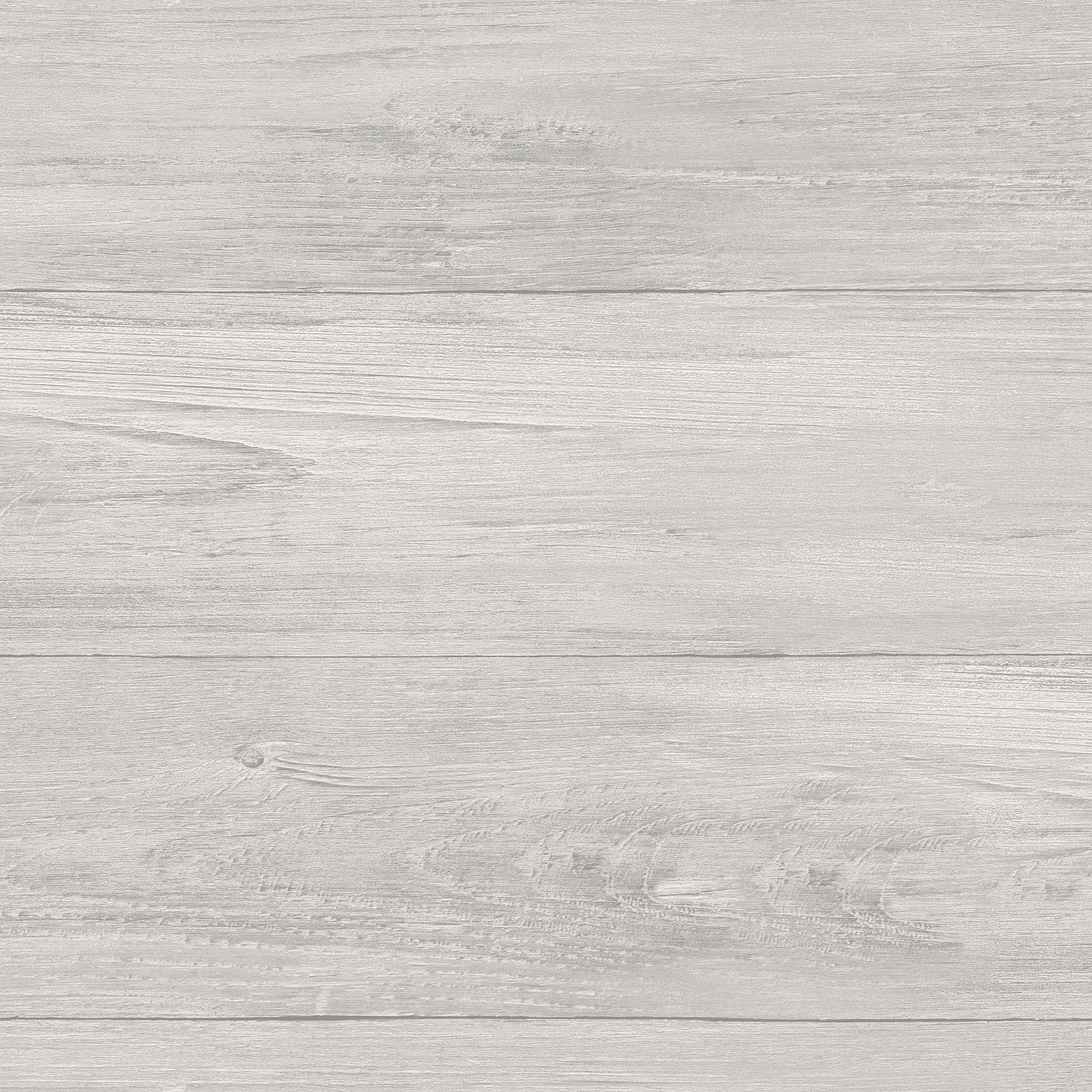
Gray Wood Plank NuWallpaper 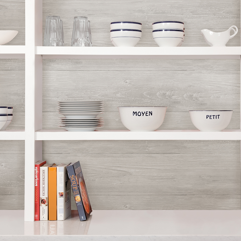
“Our Gray Wood Plank NuWallpaper has such a calming look that’s both versatile and beautiful; it’s the dressed up version of the so popular white shiplap! And it’s not just beautiful to look at, but it actually has dimensional wood grain, so it looks and feels like the real thing.”
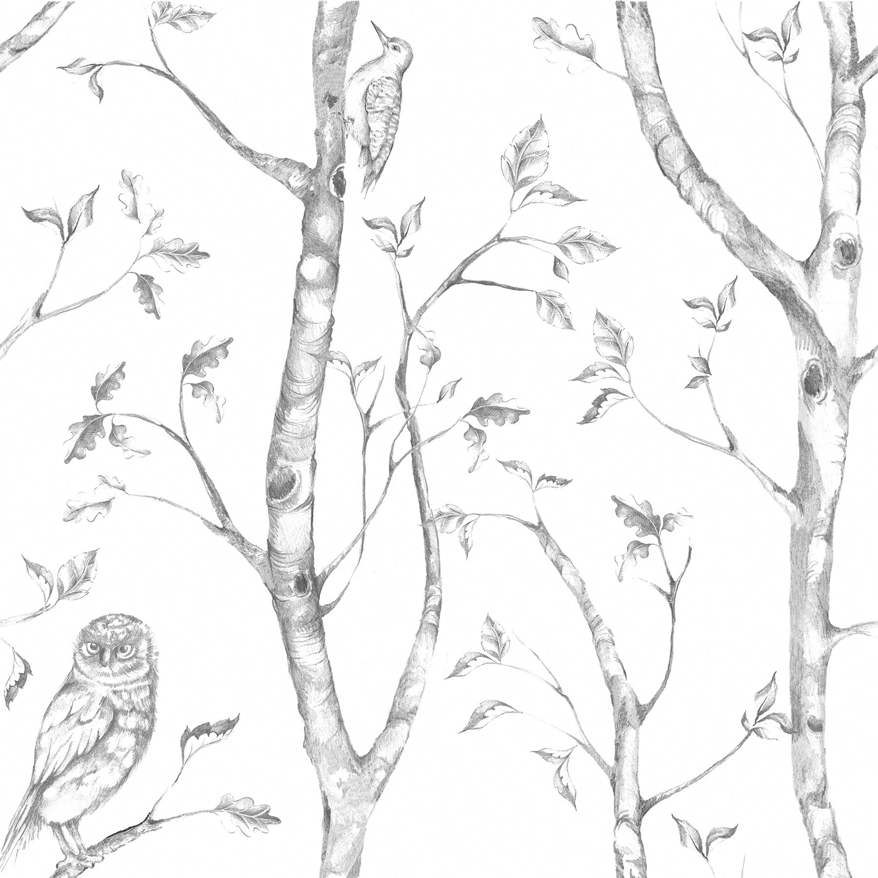
Summer Love NuWallpaper 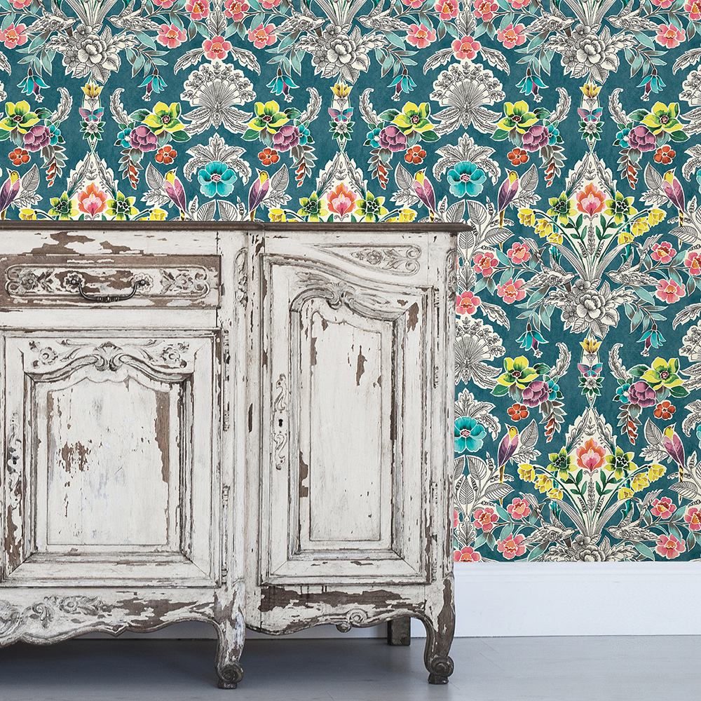
“I love the statement our Summer Love NuWallpaper makes; it’s a true feature wall conversation piece. The colors are amazing and I can’t get enough of its hand sketched floral design featuring charming birds.”
3. Amanda, Product Designer for WallPops: Vista and Gray Woods
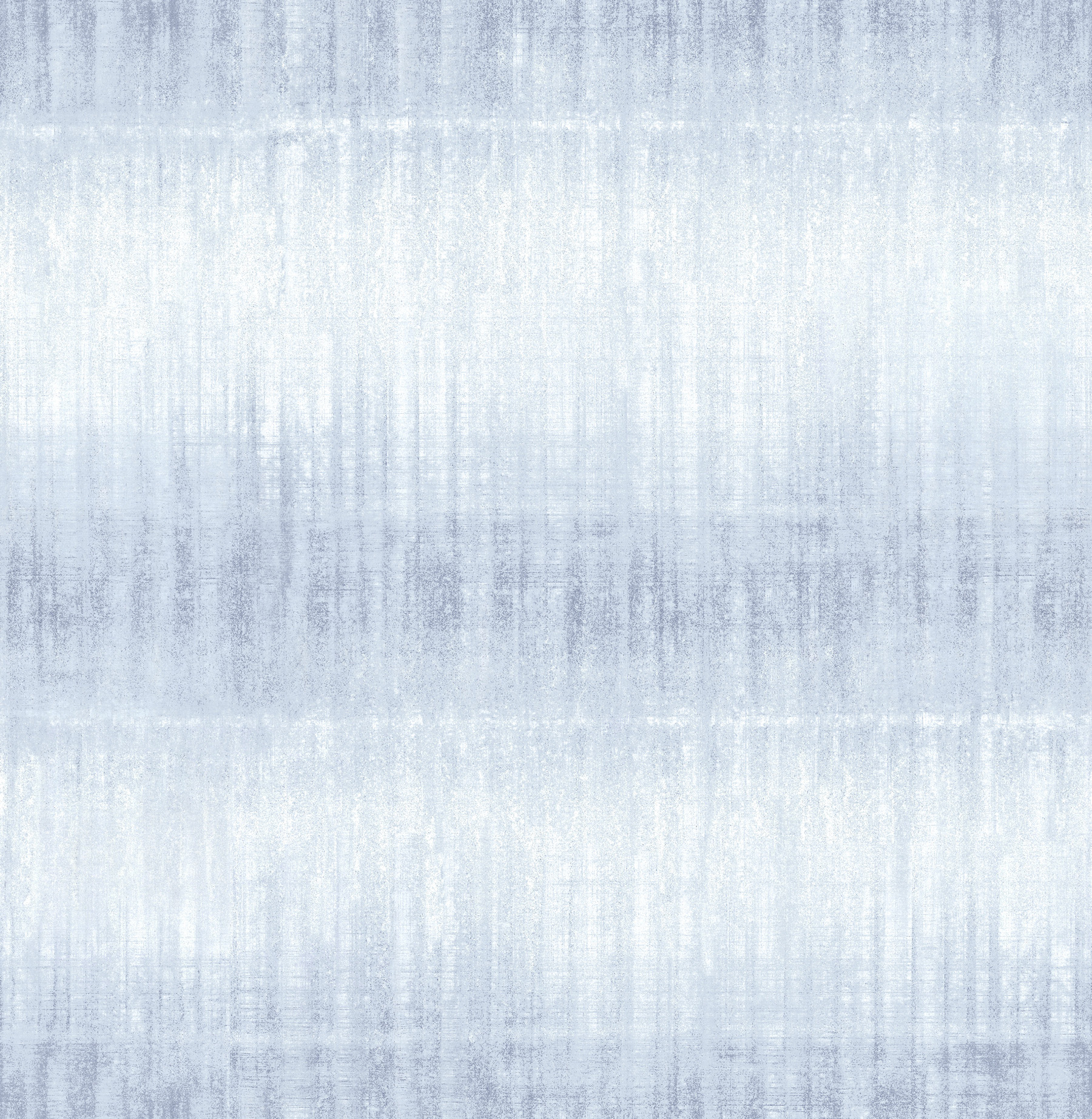
Vista NuWallpaper 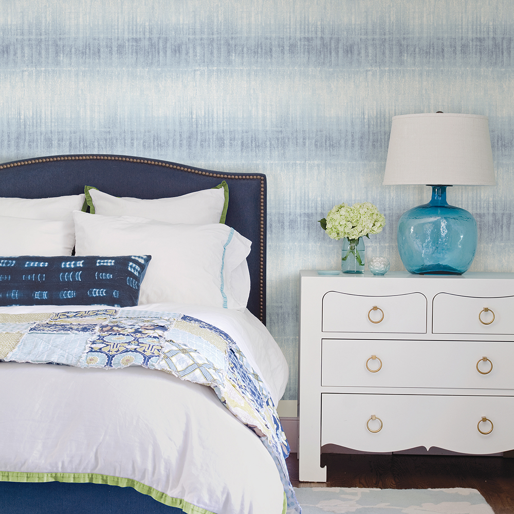
“I love the atmospheric feeling of our Vista NuWallpaper. It makes me feel like the sky is all around, and it’s calming and relaxing energy is perfect for any bedroom.”
Gray Woods NuWallpaper 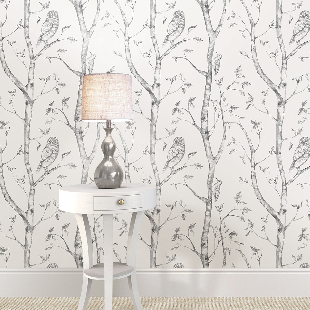
“I love the playfulness of our Gray Woods NuWallpaper design. It has a natural look but is still whimsical. It’s a great addition to any nursery.”
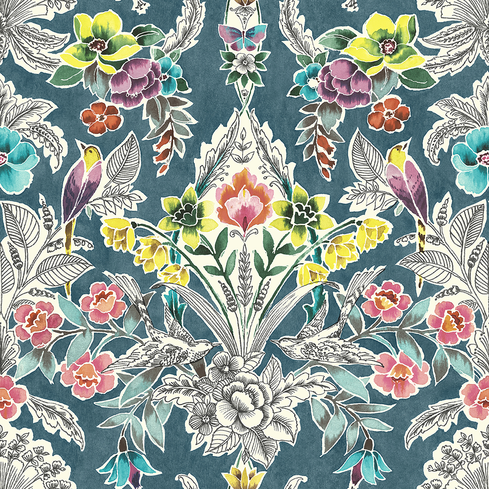
4. Nurah, WallPops Marketing Intern: Kensington Damask
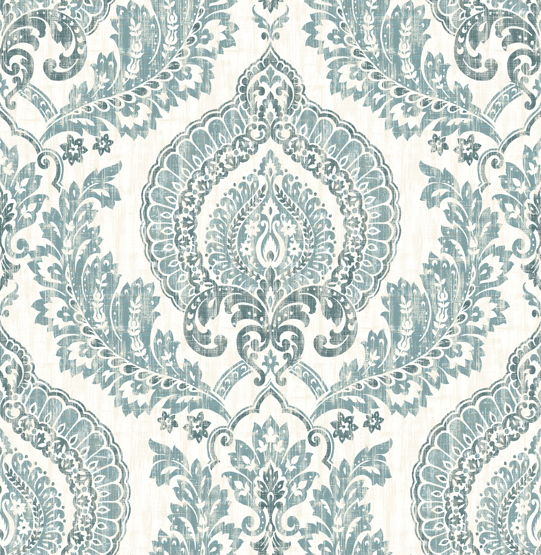
Kensington Damas 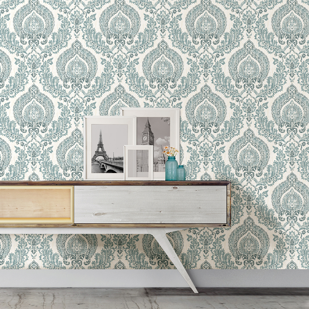
“As someone who loves bohemian style, I fell head over heels for this Kensington Damask NuWallpaper. Its beautiful blue colors is what initially caught my eye. With a print as bold as this, I would pair it with more earth tones and minimalist decor, because this design would definitely be the star of the show!”
5. Shelby, Marketing Content Coordinator: Blue Florentine Tile and Kylver
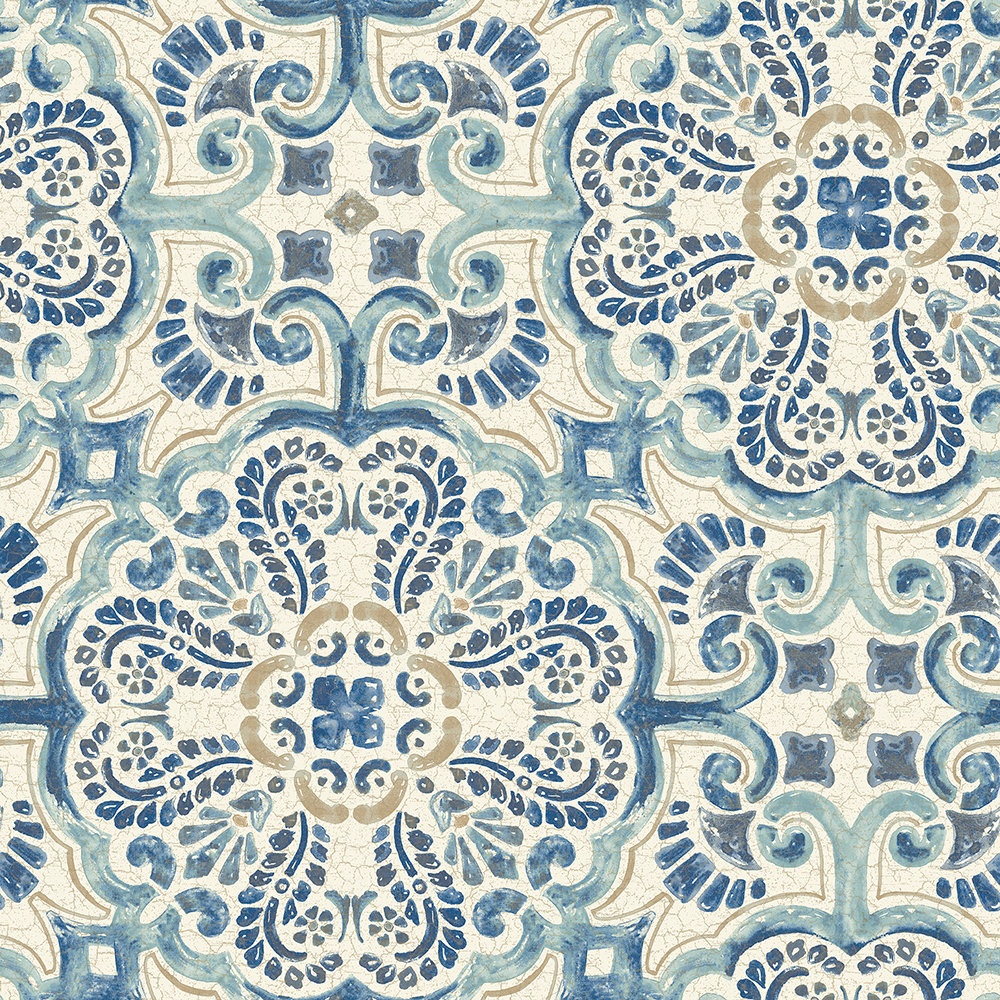
Blue Florentine Tile NuWallpaper 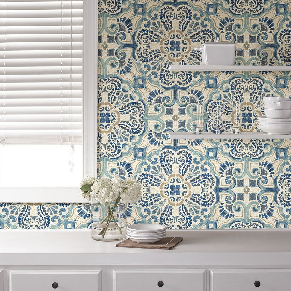
“Our Blue Florentine Tile NuWallpaper is my favorite faux effects design! I love the Spanish influence and the crackle effect – not to mention its soothing hues!”
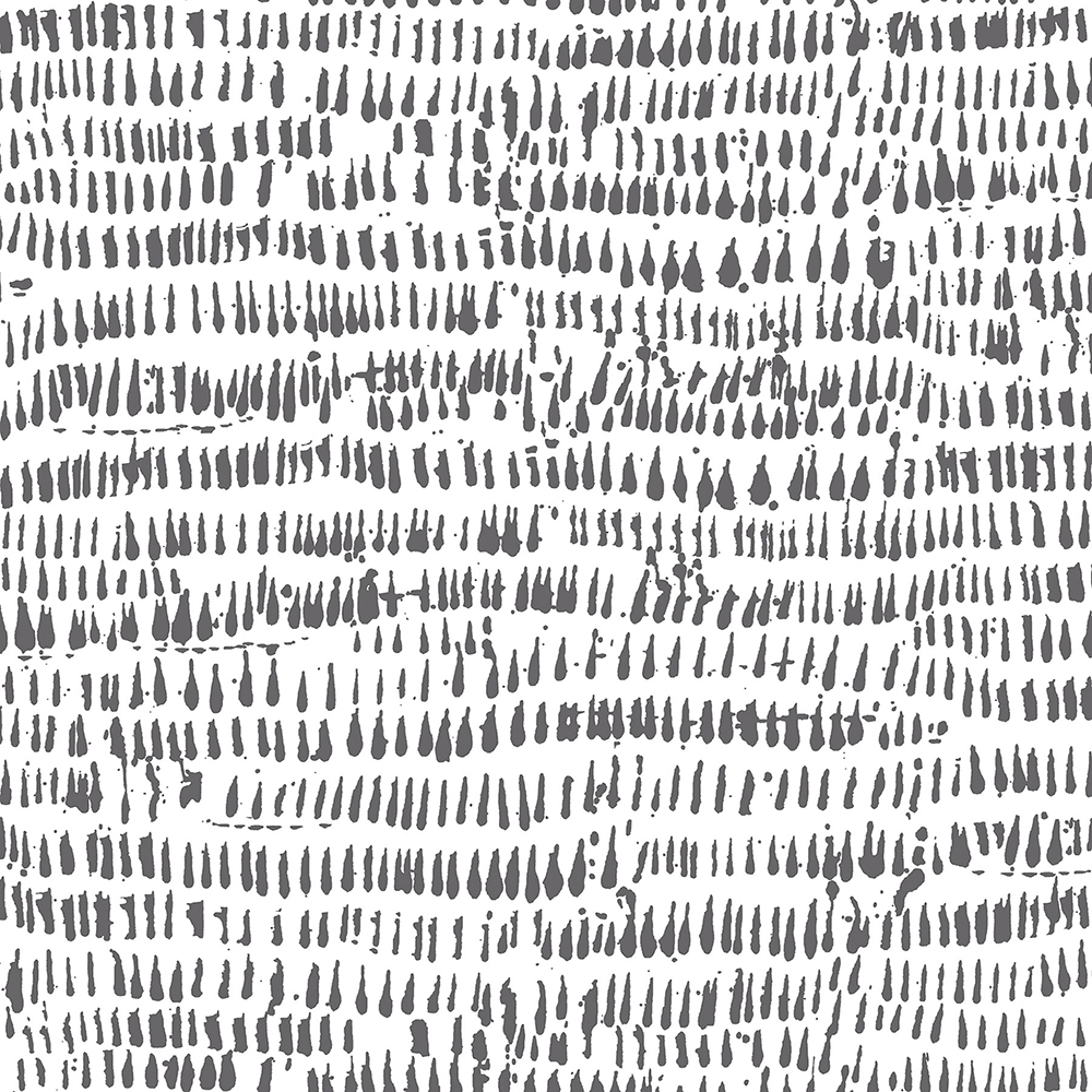
Kylver NuWallpaper 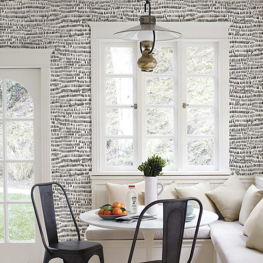
“I was so excited when I saw our studio working on this Kylver NuWallpaper. I love the black brushstroke pattern and how it creates a stunning textural effect. It’s both modern and free-spirited and I can’t get enough of it!”