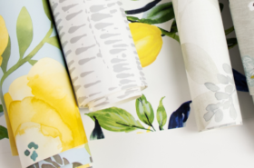
With fabulous patterns and the ease of peel and stick, NuWallpaper and FloorPops make transforming homes into a DIY dream painless and fun! Take the next step in your WallPops design journey and incorporate both of them into your space. Don’t know where to start? No worries! Our extensive FloorPops and NuWallpaper style guide walks you through five different ways to mix and match your favorite peel and stick products!
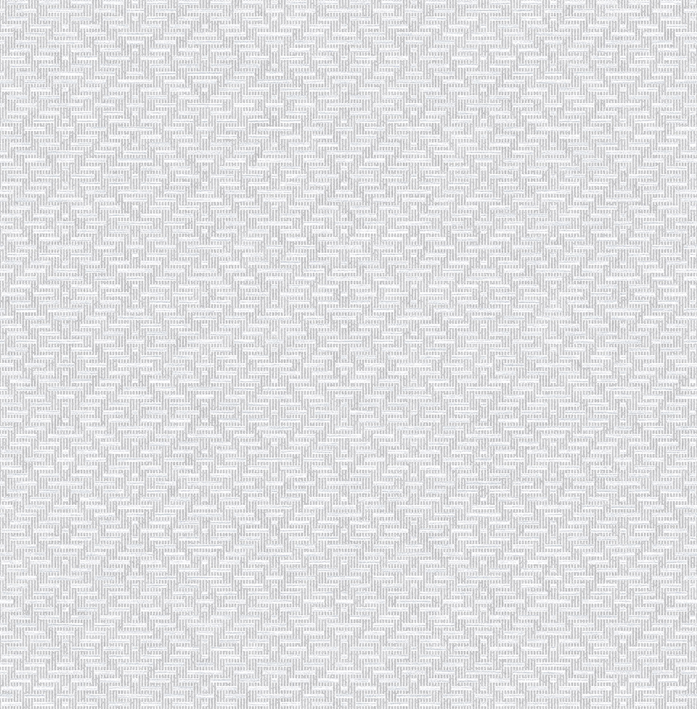
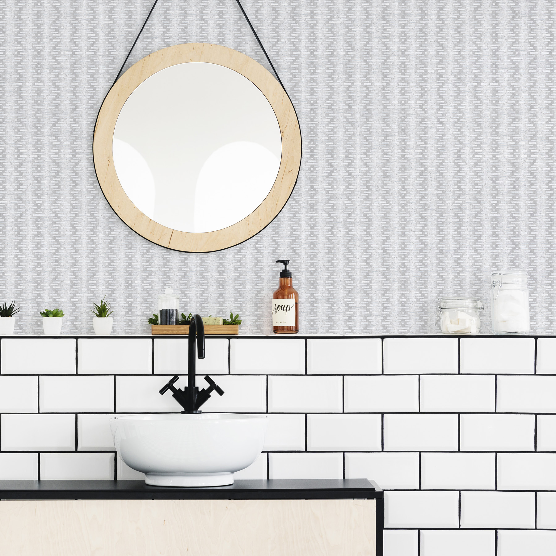
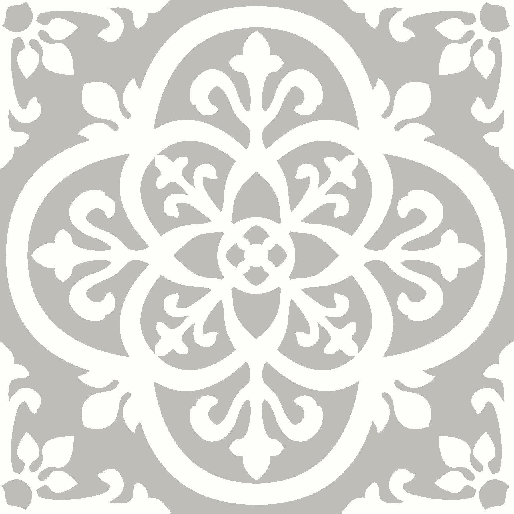
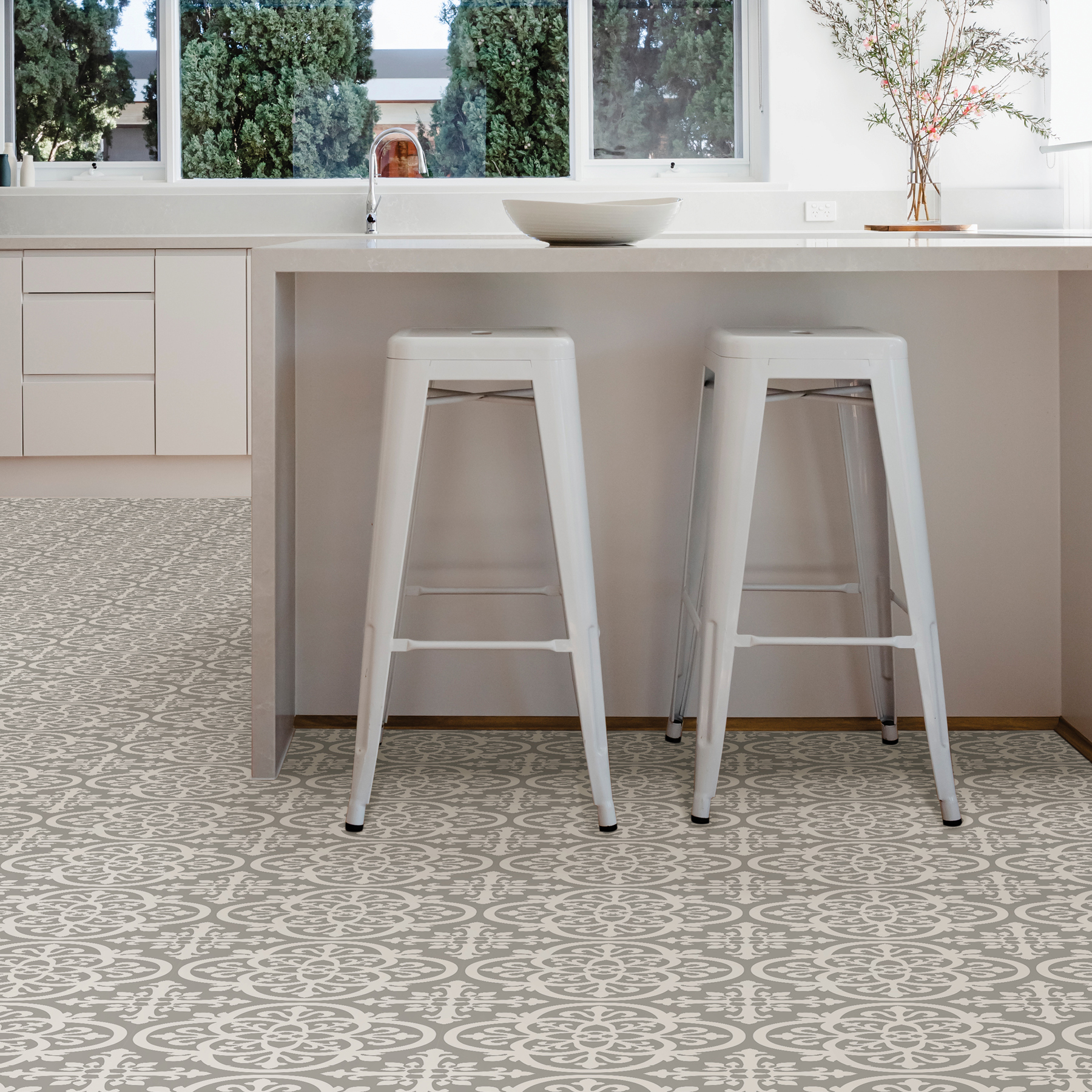
Remy and Grey Breezy
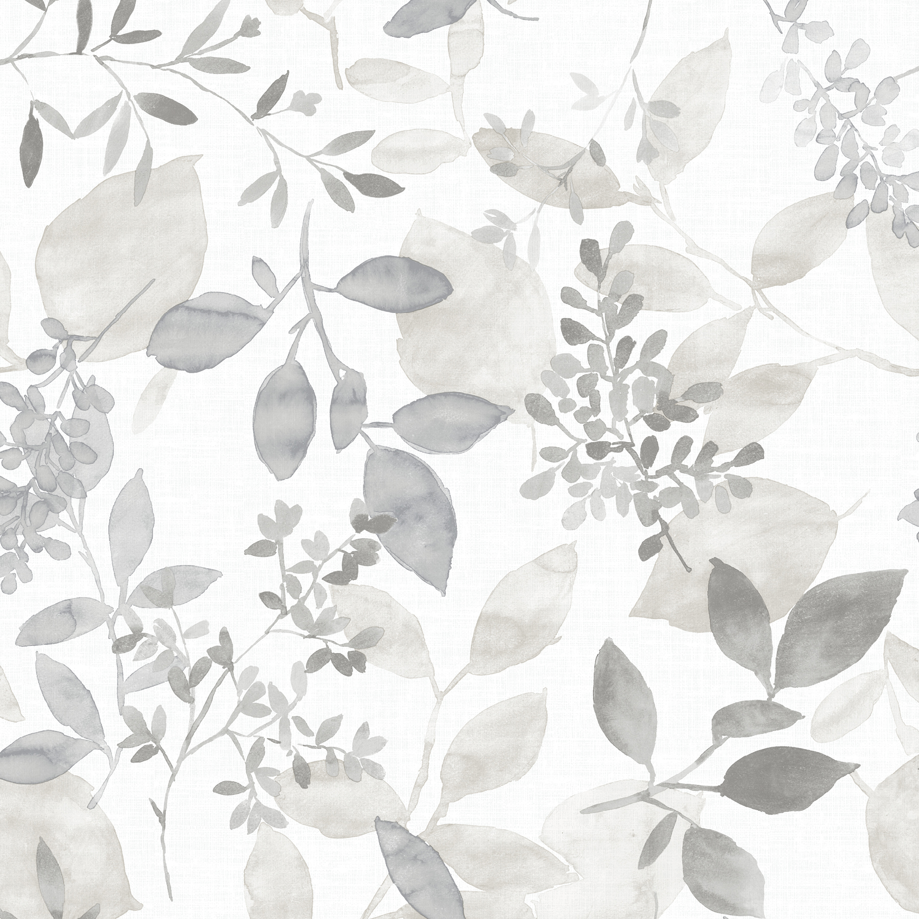
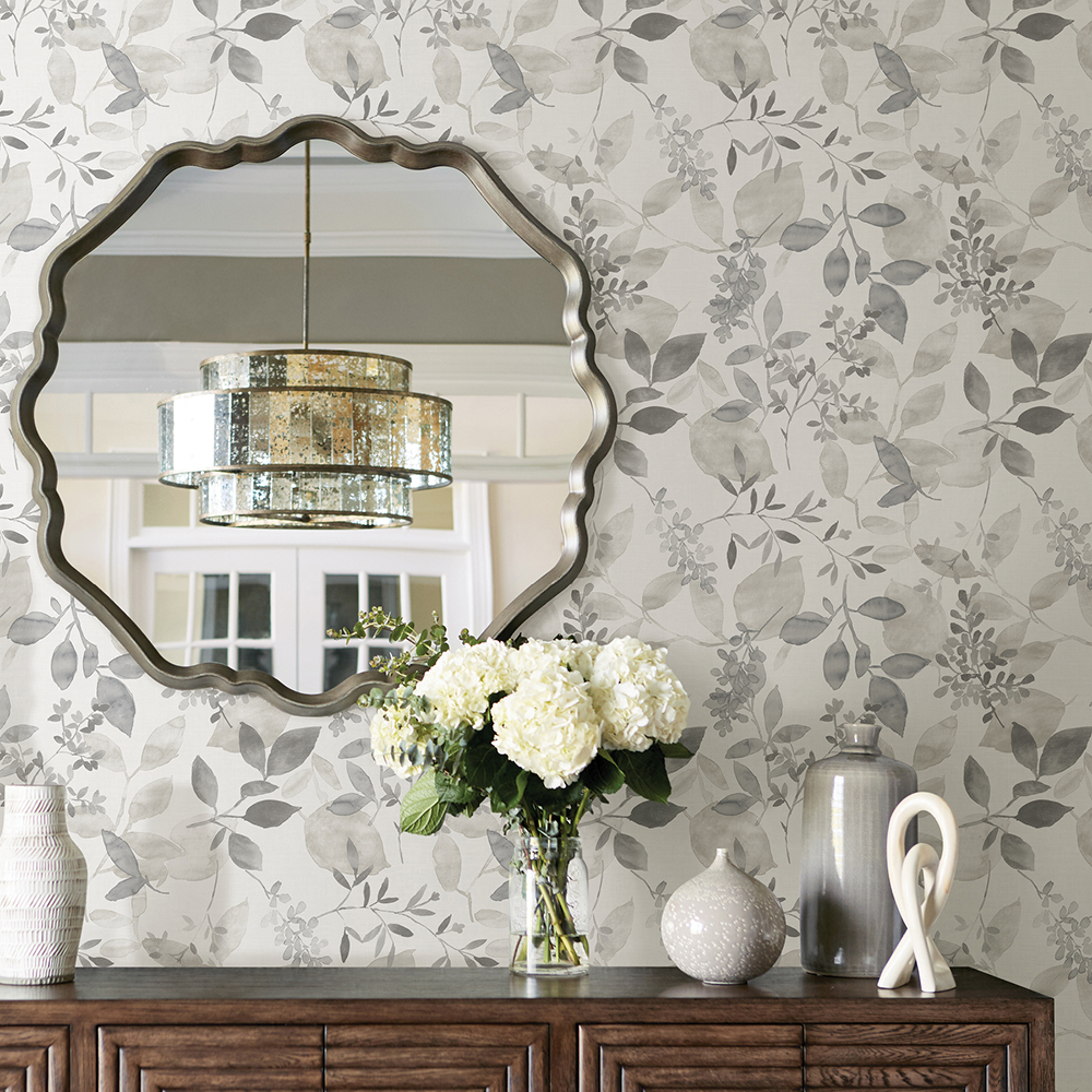
A beautiful play on the classic grey and white palette, our Remy FloorPops and Grey Breezy NuWallpaper will add an ethereal vibe to rooms. The delicate watercolor style of Breezy is grounded by Remy’s ironwork motif, while shared vine accents tie the look together with a chic organic flair.
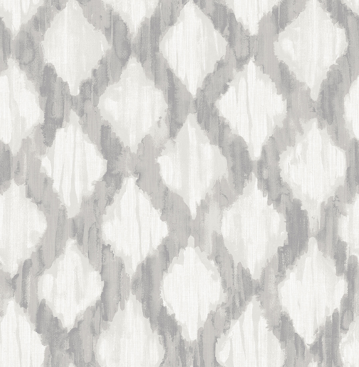
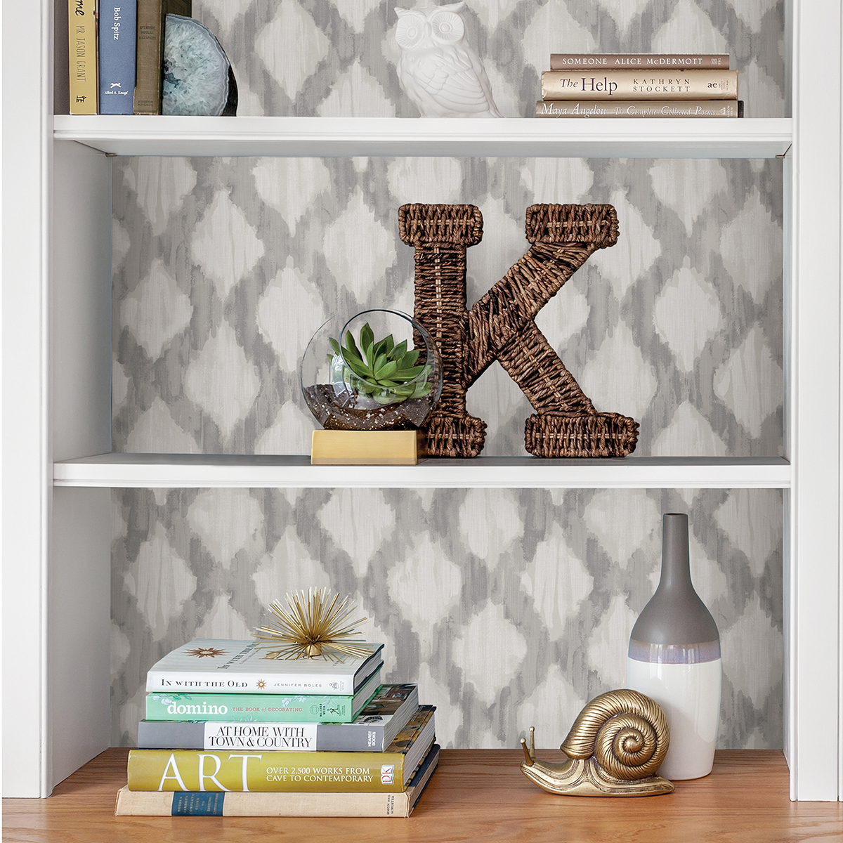
Sevilla and Cambria
With globally inspired geometrics, our Sevilla FloorPops and Cambria NuWallpaper are perfect for creating a bohemian space. Raised inks add an ikat flair to the peel and stick wallpaper, while Sevilla’s dark grey hues ground Cambria’s breezy energy.
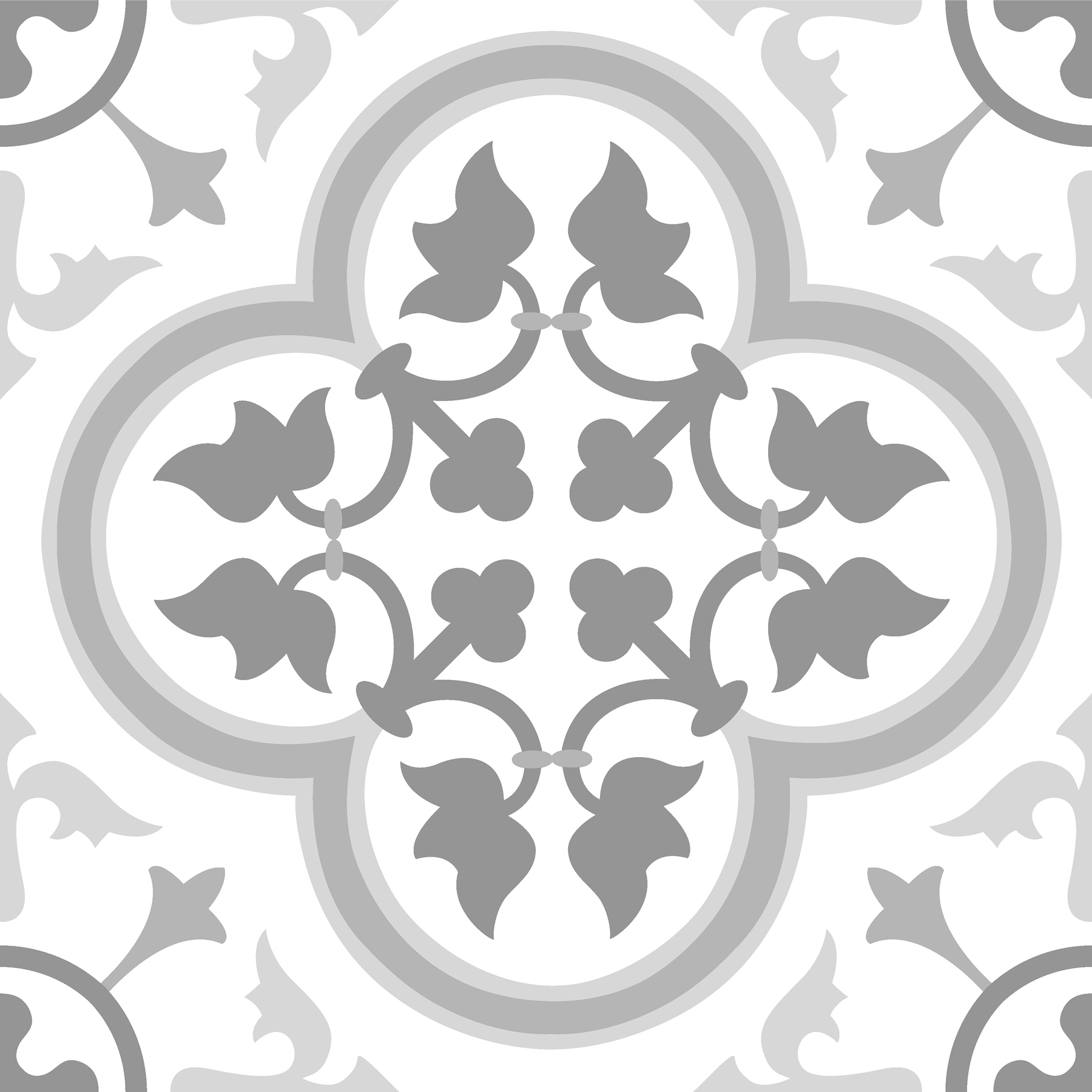
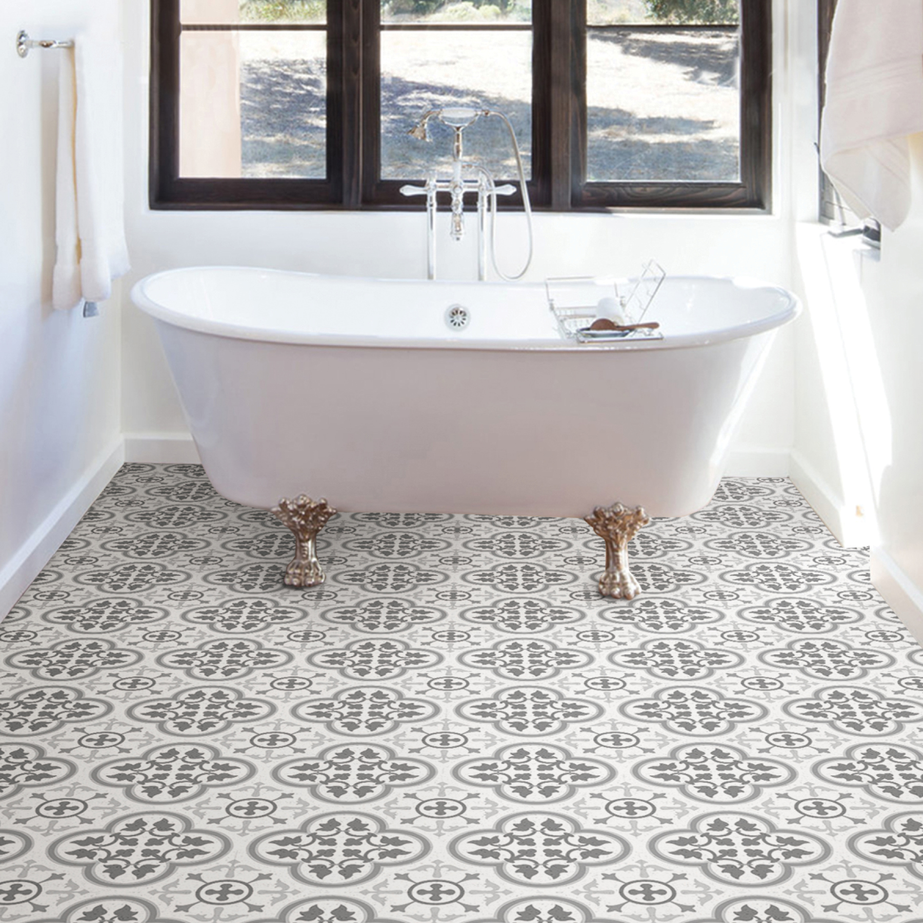
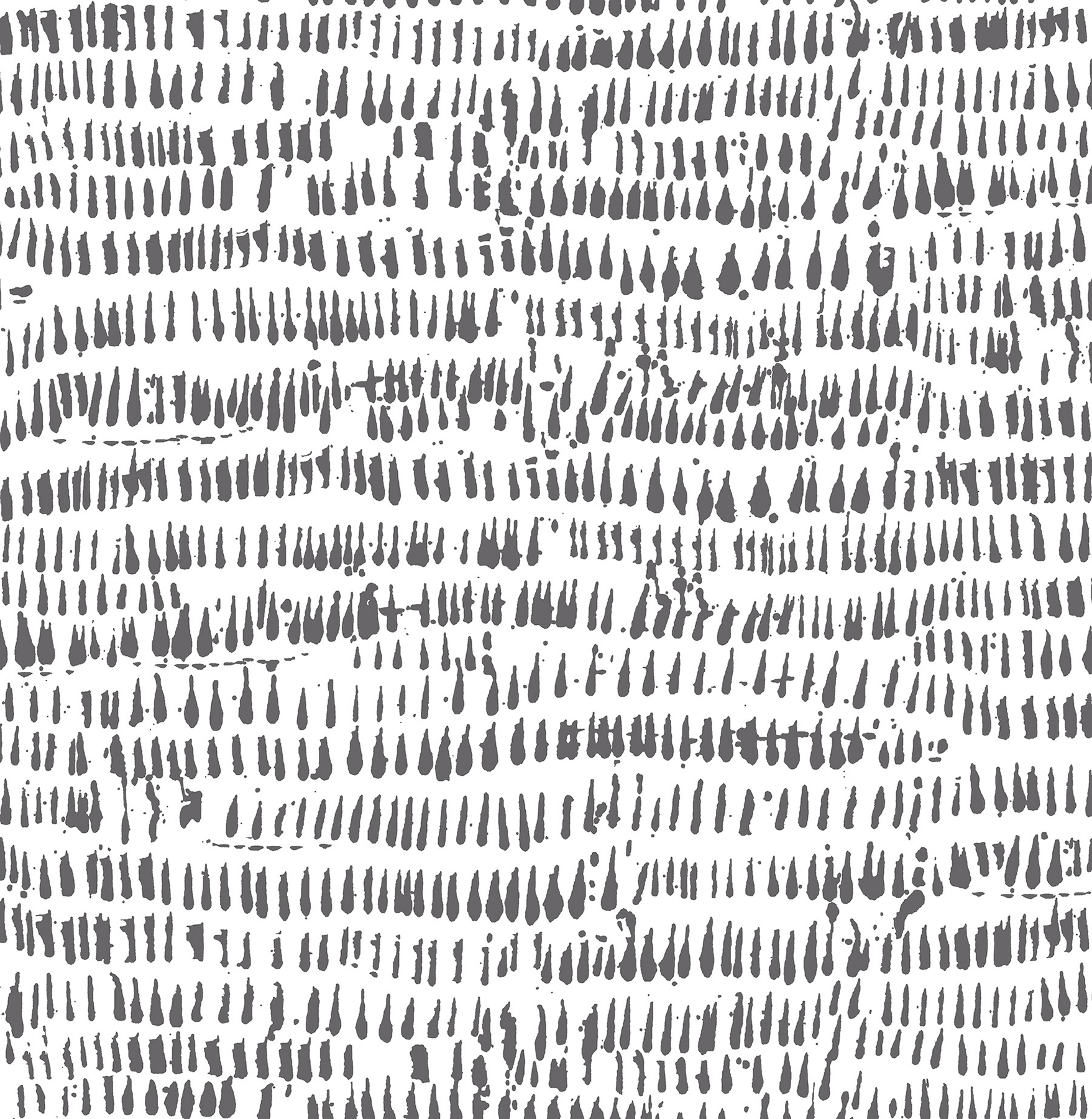
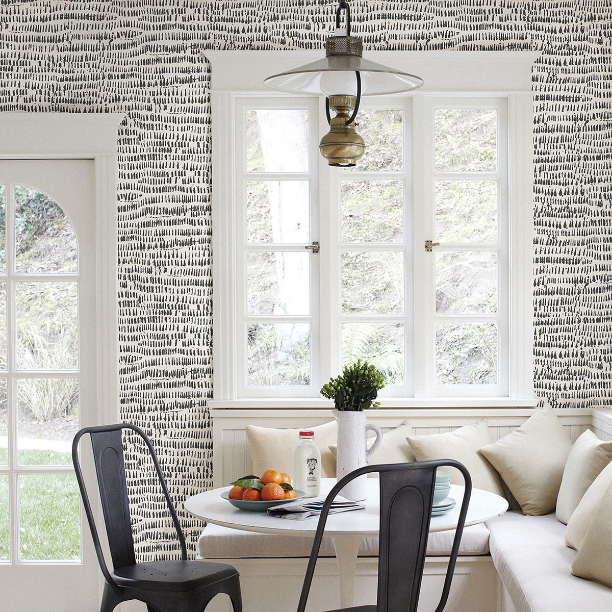
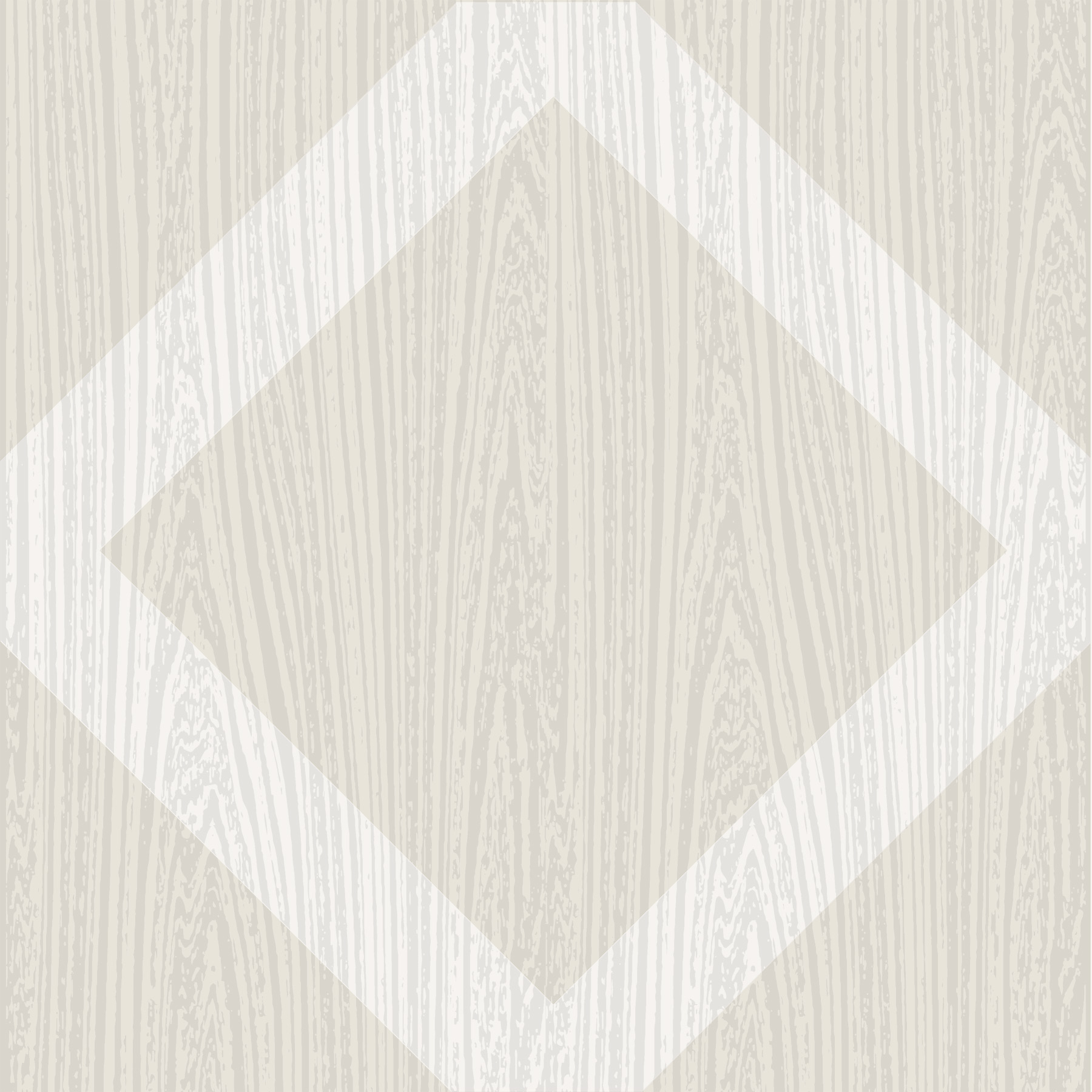
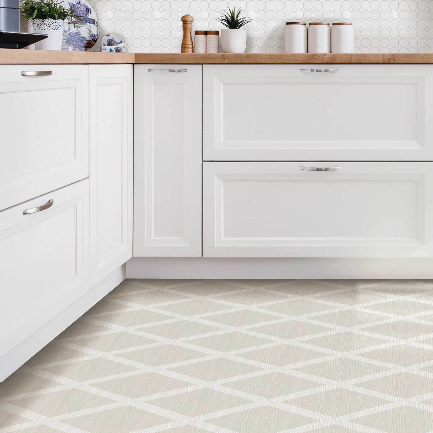
Medina and Terrain
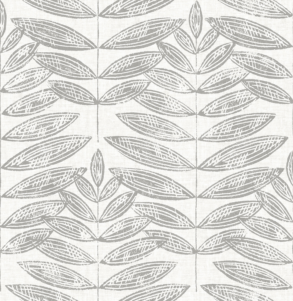
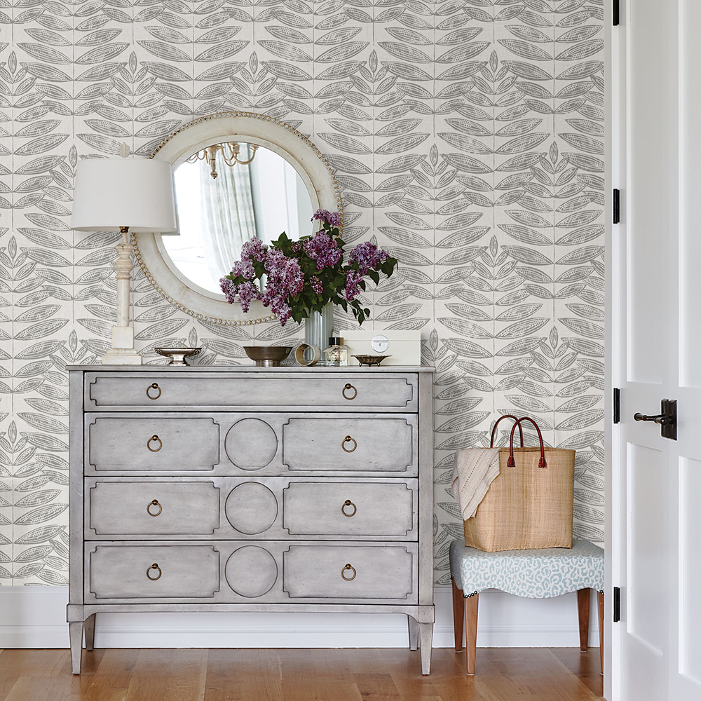
Farmhouse with a Scandinavian influence, our Medina FloorPops and Terrain NuWallpaper embody a cozy energy. This dynamic duo effortlessly balances nature inspired prints and ironwork designs with oh-so-chic grey hues.
Radiance and Tibetan Teal Faux Grasscloth
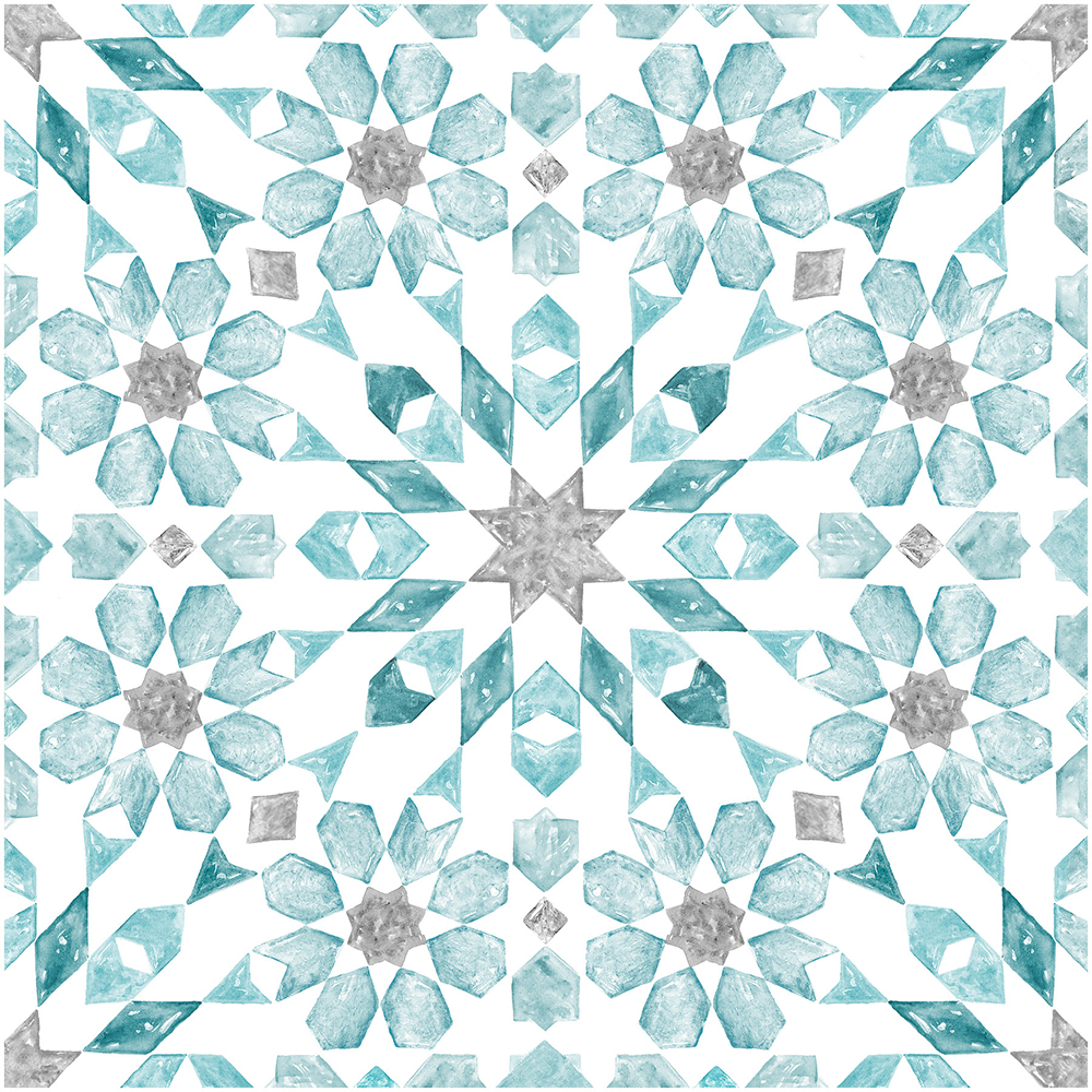
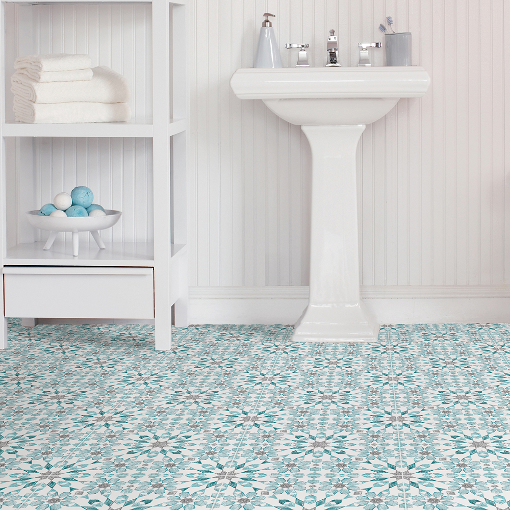
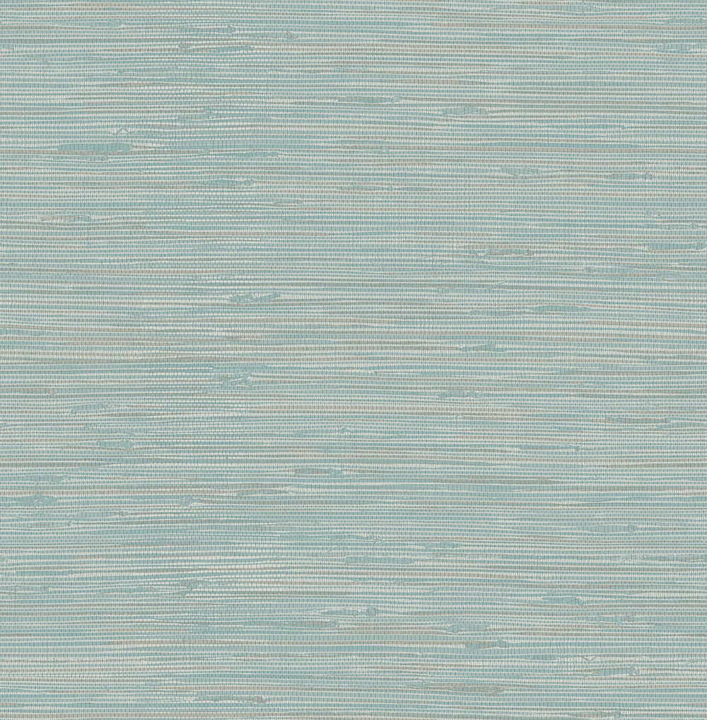
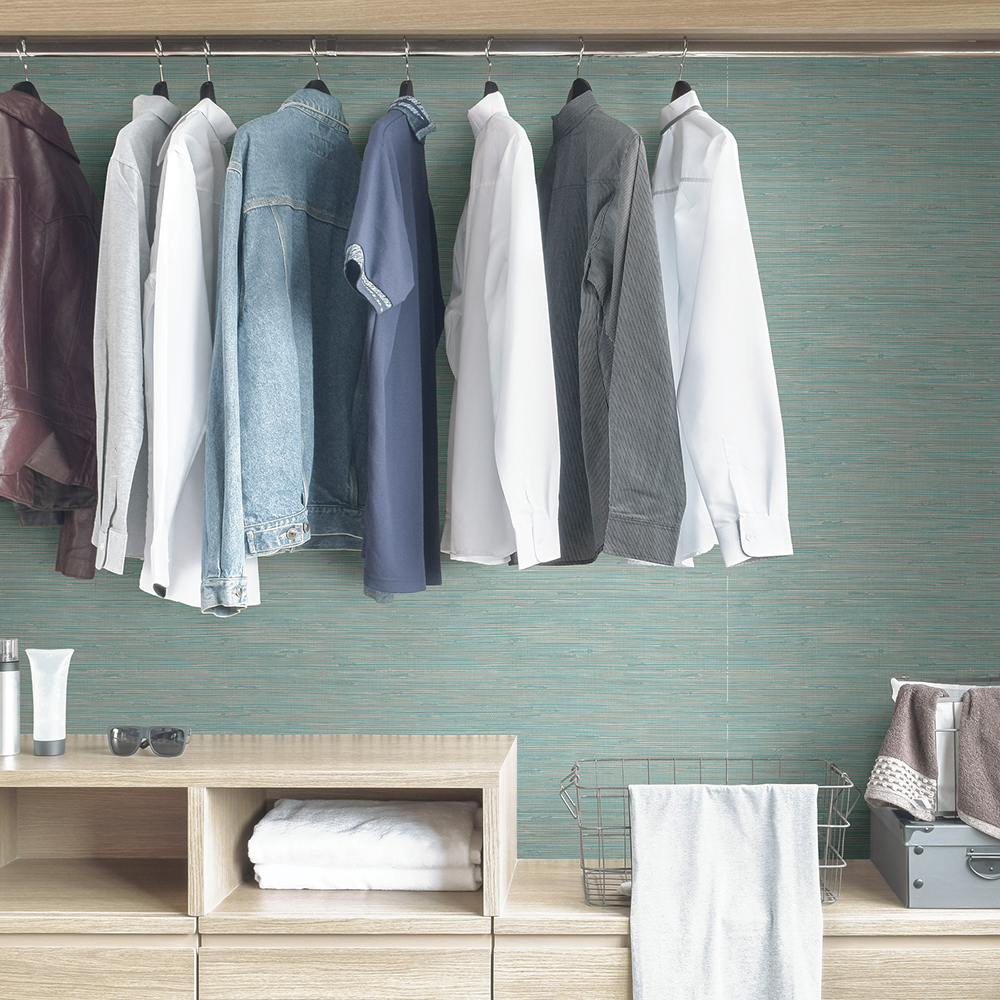
Transform rooms into a soothing oasis with our Tibetan peel and stick wallpaper and Radiance FloorPops. The hand painted effect of the Radiance tiles beautifully complements the NuWallpaper’s intricately woven design. Swirls of teal, aqua and turquoise meld to create an airy energy from the ground up.
Anitco and Grey Flotaing Trellis
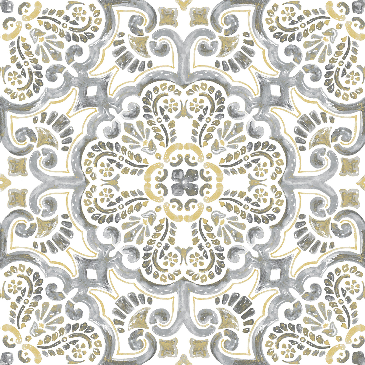
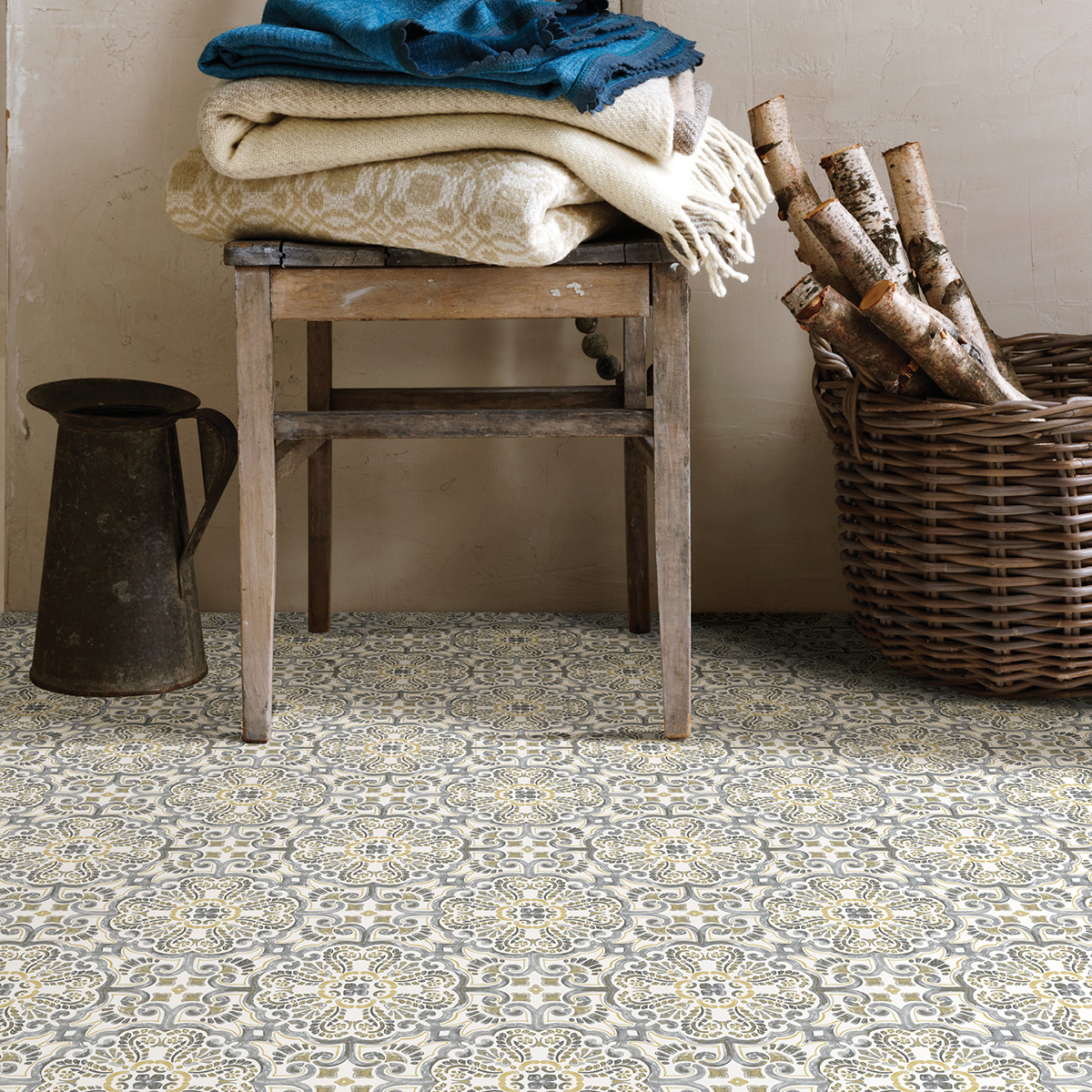
Create a breezy bohemian escape with our Antico FloorPops and Grey Floating Trellis NuWallpaper. Both products dazzle with painterly styles and globally inspired designs. The grey, white and soft yellow palettes found in both of their palettes will tile the room together for a completed look.
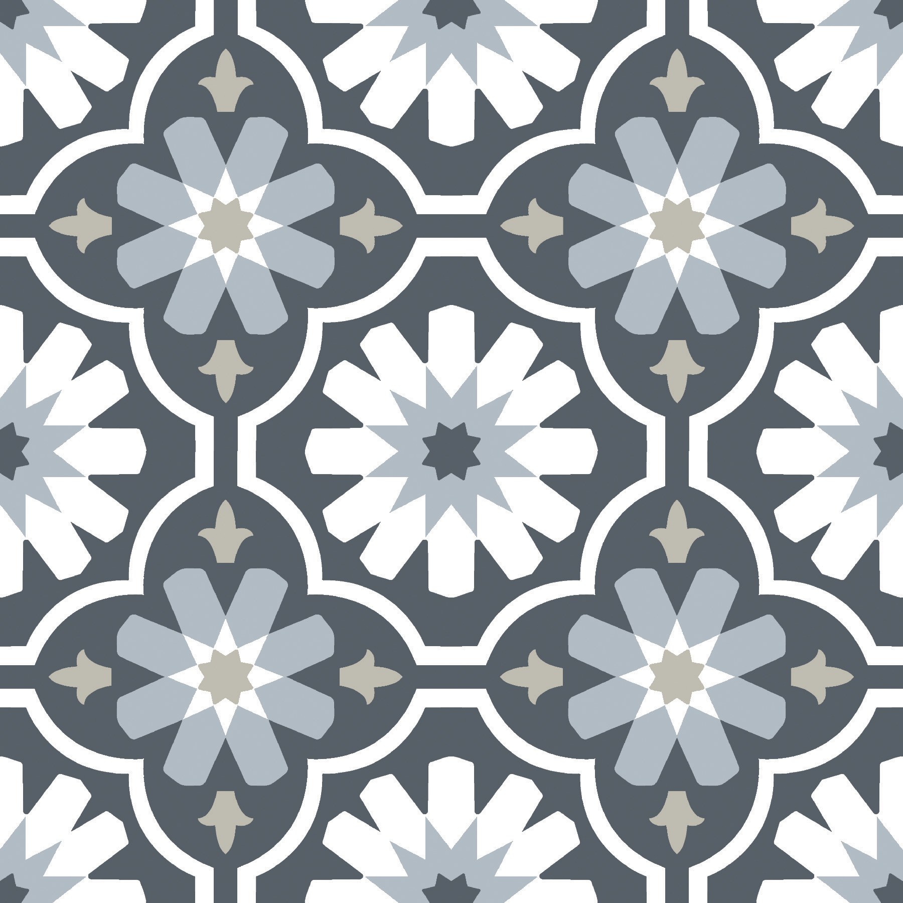
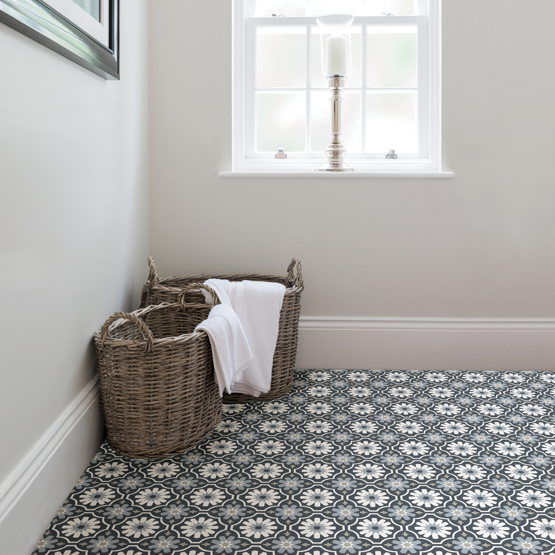
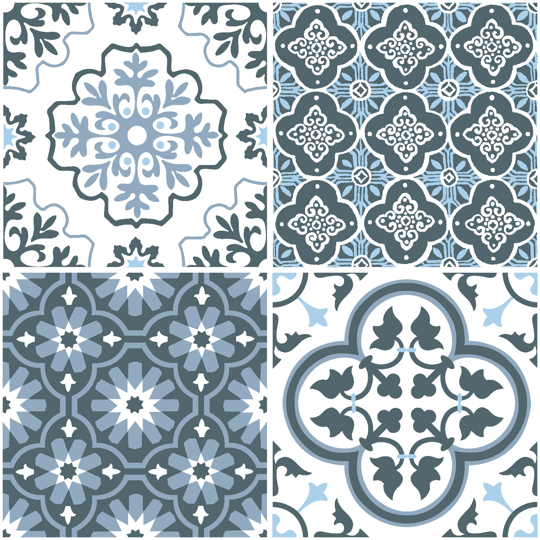
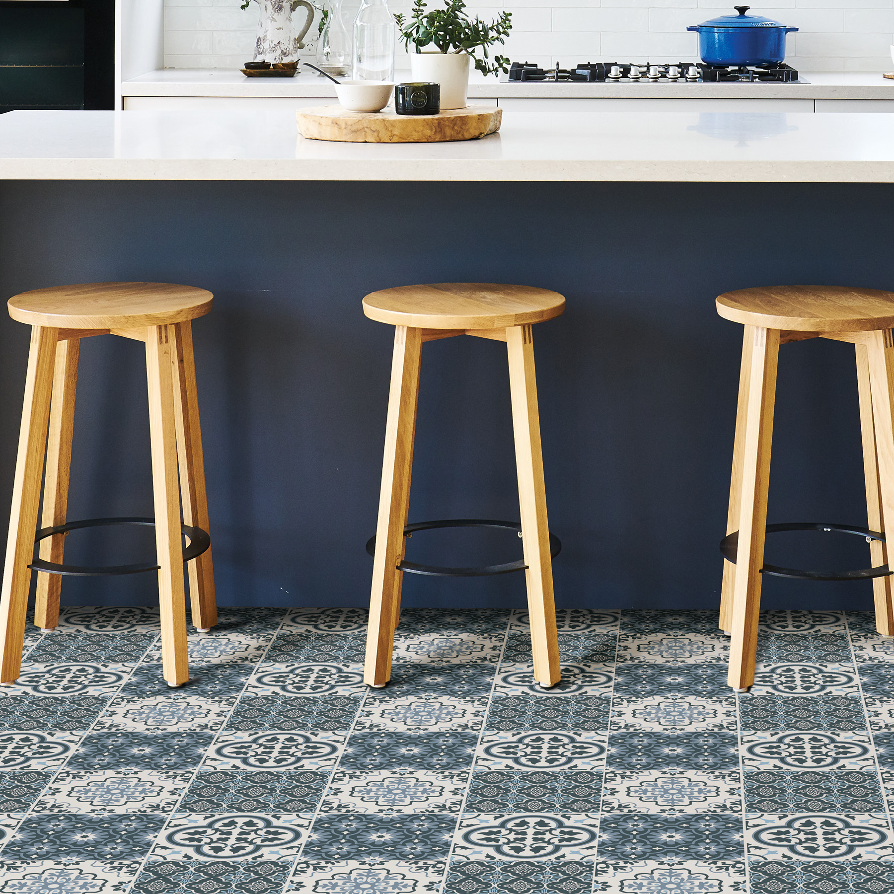
Comet and Kylver
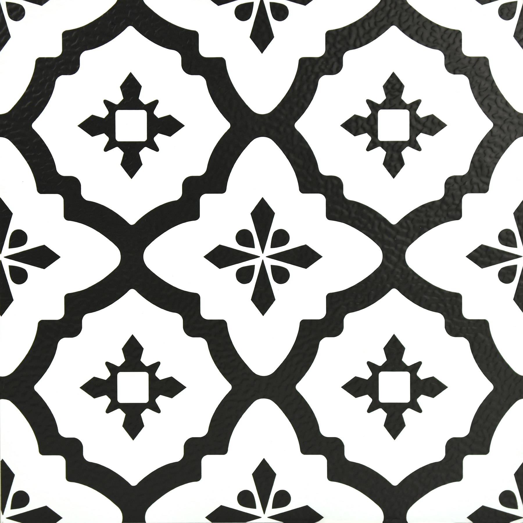
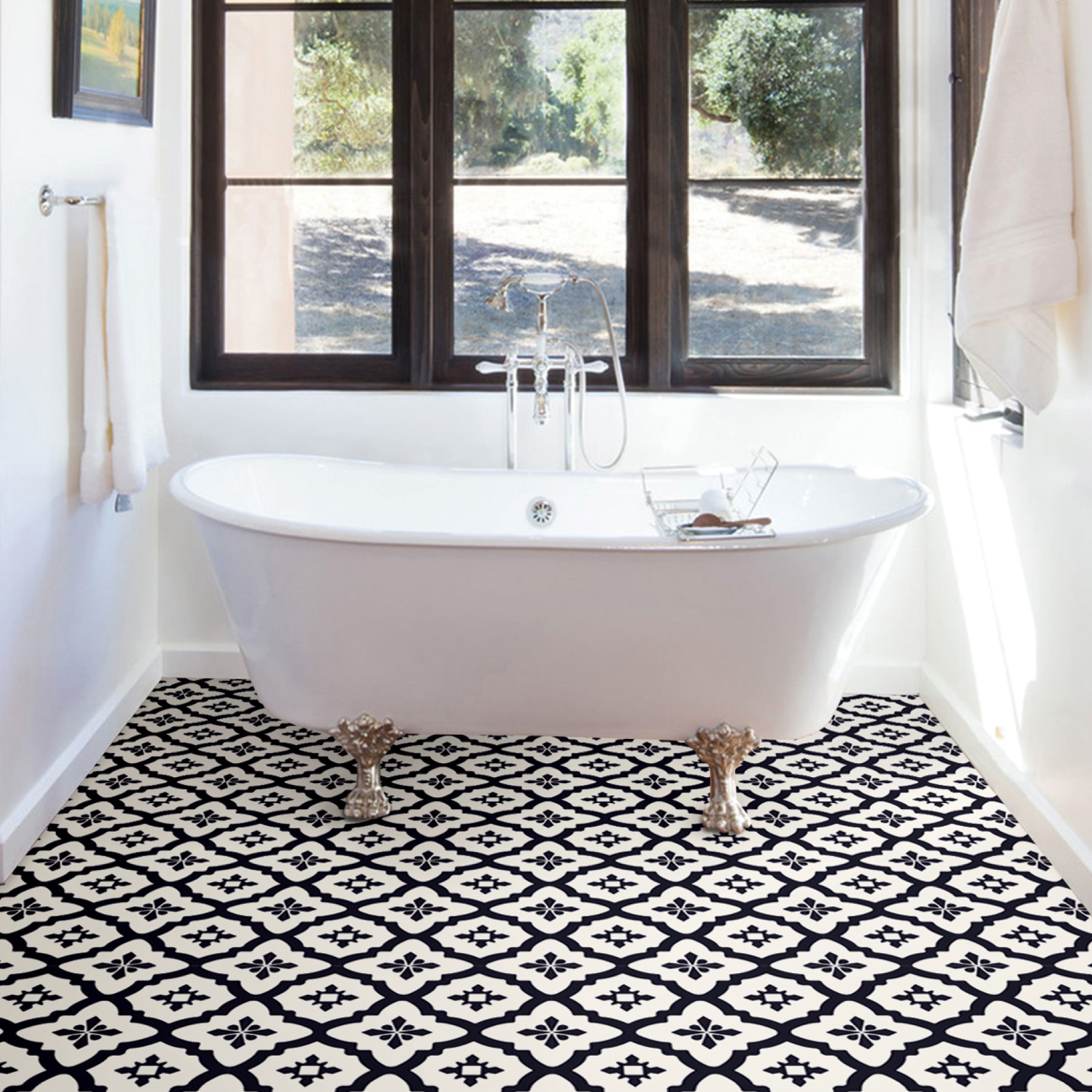
The perfect balance of classic and contemporary, paring Comet FloorPops with Kylver NuWallpaper will create an abstract look with a timeless flair. Both have an-ever-chic palette of black and white that is perfect for modern and traditional homes alike.
Illusion and Charcoal Merriment
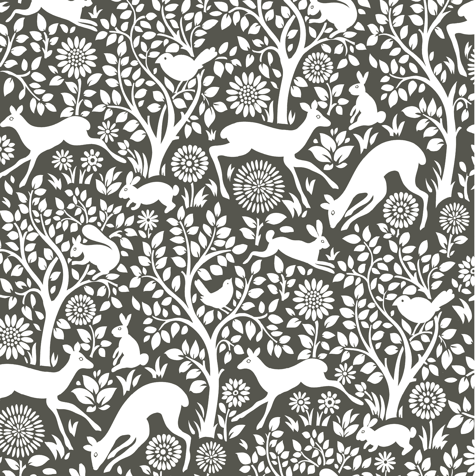
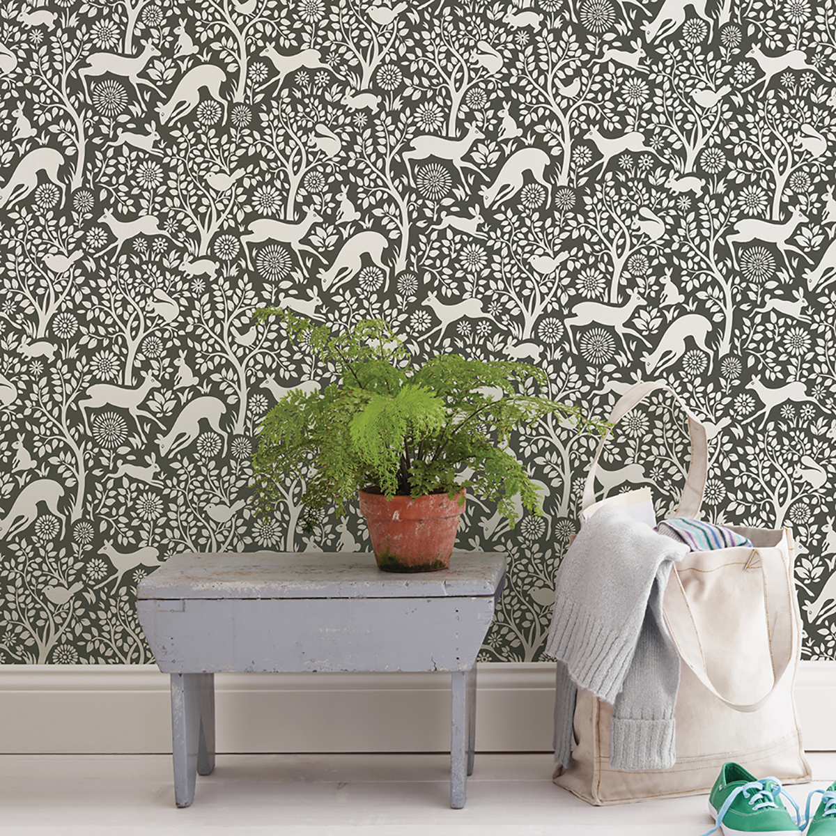
Cozy and inviting, our Charcoal Merriment NuWallpaper and Illusion FloorPops are a match made in Scandinavian-heaven. The prancing forest animals of the peel and stick wallpaper have a folksy energy, while the rich brown backdrop complements Illusion’s wood inspired design.
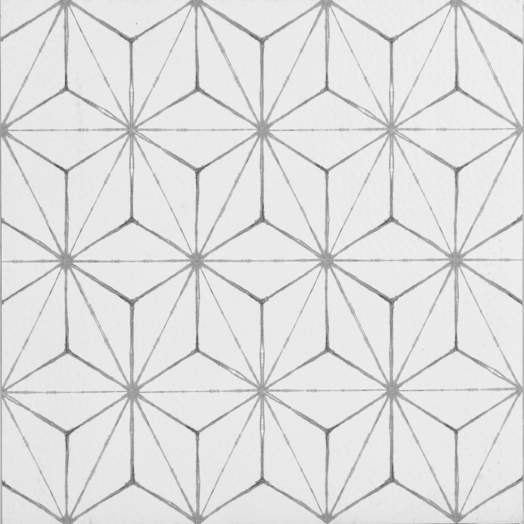
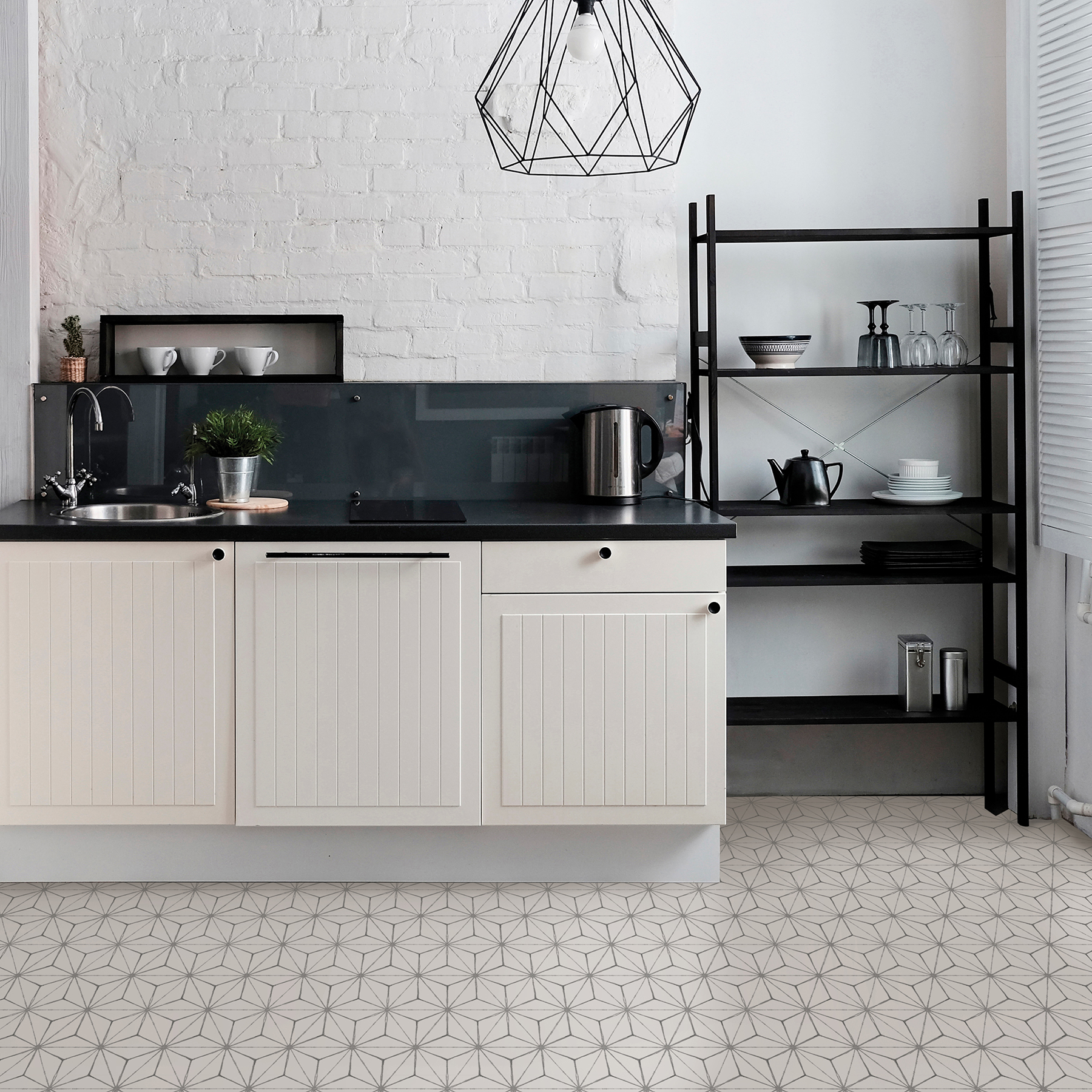
Myriad and Navy Poplin Texture
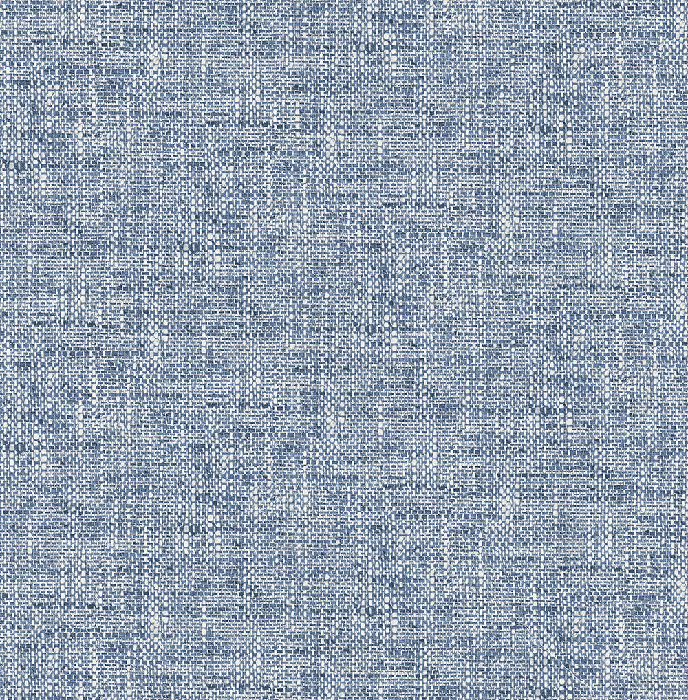
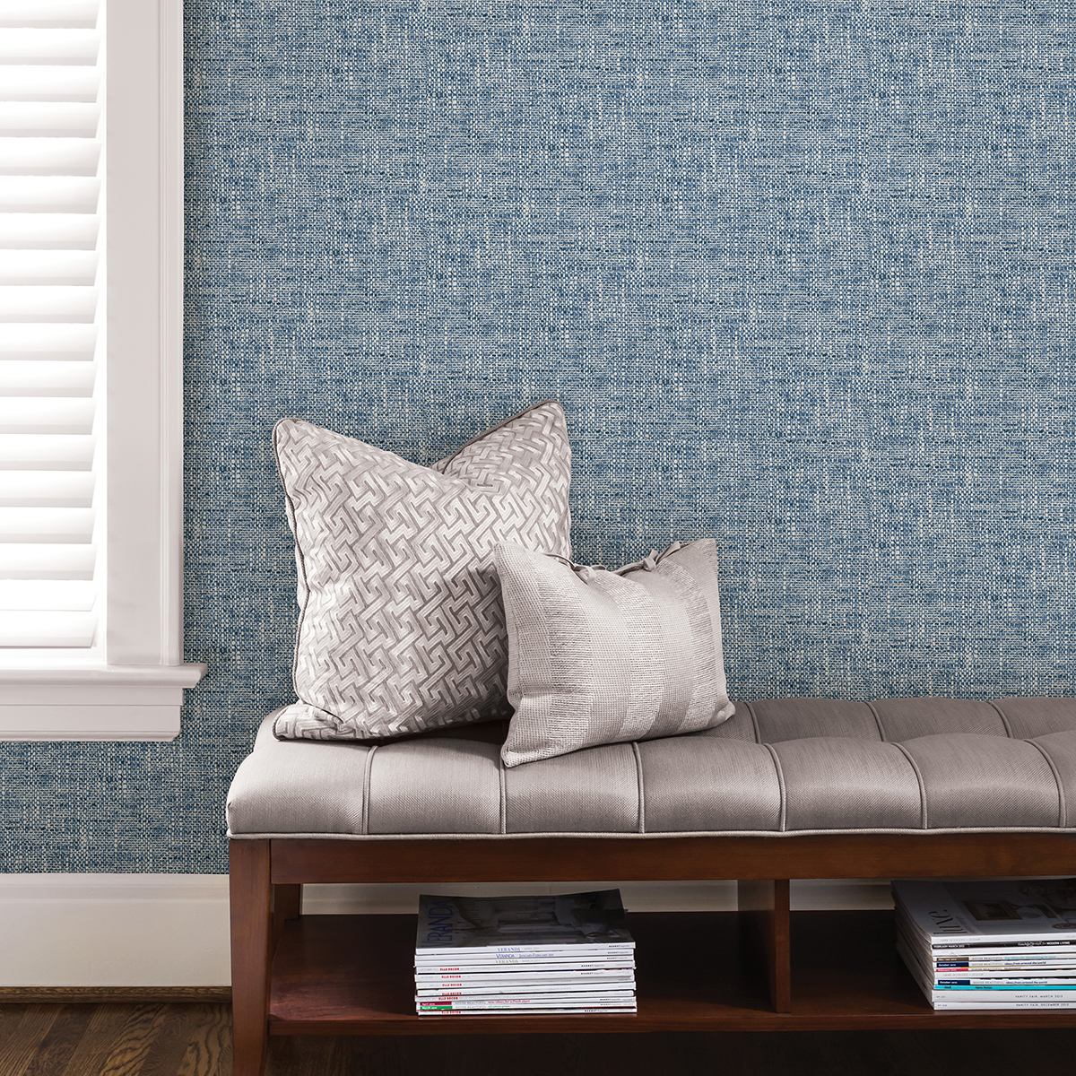
Add a splash of color to floors and walls with our Myriad peel and stick tiles and Navy Poplin Texture NuWallpaper. Both products offer a range of soothing blue hues to transform rooms into a serene abode. Raised ink details on the Poplin pattern add to the authentic look of its woven design, while clover and star motifs of the Myriad FloorPops create a boho chic look.
Kikko and Make it Rain
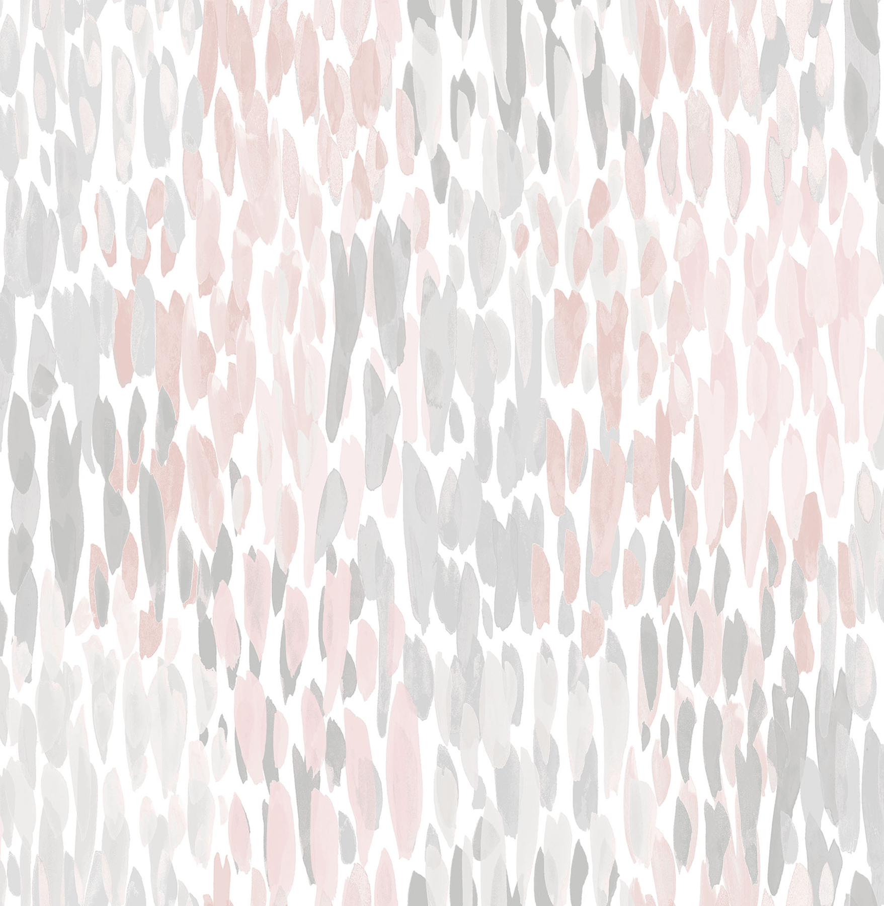
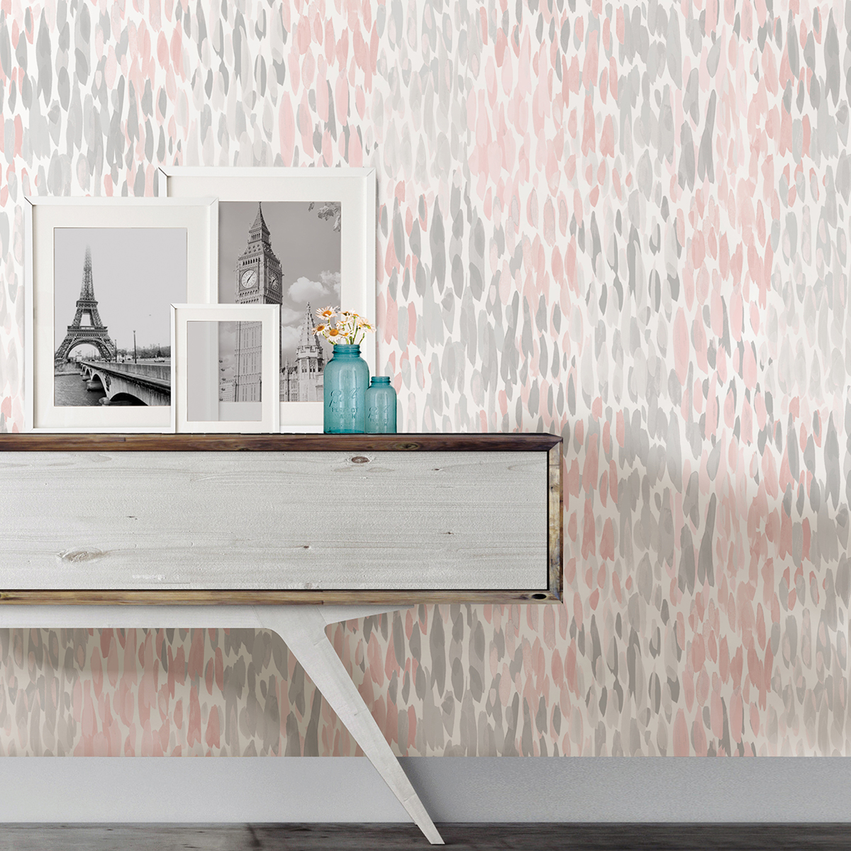
Calling all contemporary decorators! With an intricate geometric print and an abstract raindrop pattern, our Kikko FloorPops and Blush Make it Rain NuWallpaper are a modern dream. Kikko’s sharp-edged design is softened by the watercolor style of the peel and stick wallpaper, perfect creating a complementary and cohesive look.
Have a favorite FloorPops and NuWallpaper combination? We’d love to know; leave a comment below and don’t forget to tag us in your photos on Instagram @wallpops!